Empowering rainbow and takatāpui communities
A team of queer creatives with a strong commitment to their community and Tiriti-centered approaches crafted a meaningful and memorable visual identity. The goal was to establish a genuine brand that represented and provided opportunities for takatāpui and rainbow communities at Massey University. This vision led to the creation of Kāhui Irarau, a platform offering a safe and inclusive space for support, connection, and initiatives promoting diversity and inclusion.


Strategic approach
Taking a co-design approach to ensure fair representation and meaningful engagement with the community, prioritising collaboration, feedback, and iterative design.
Involving the community by engaging users and staff in the design process to reflect their voices in the outcome.
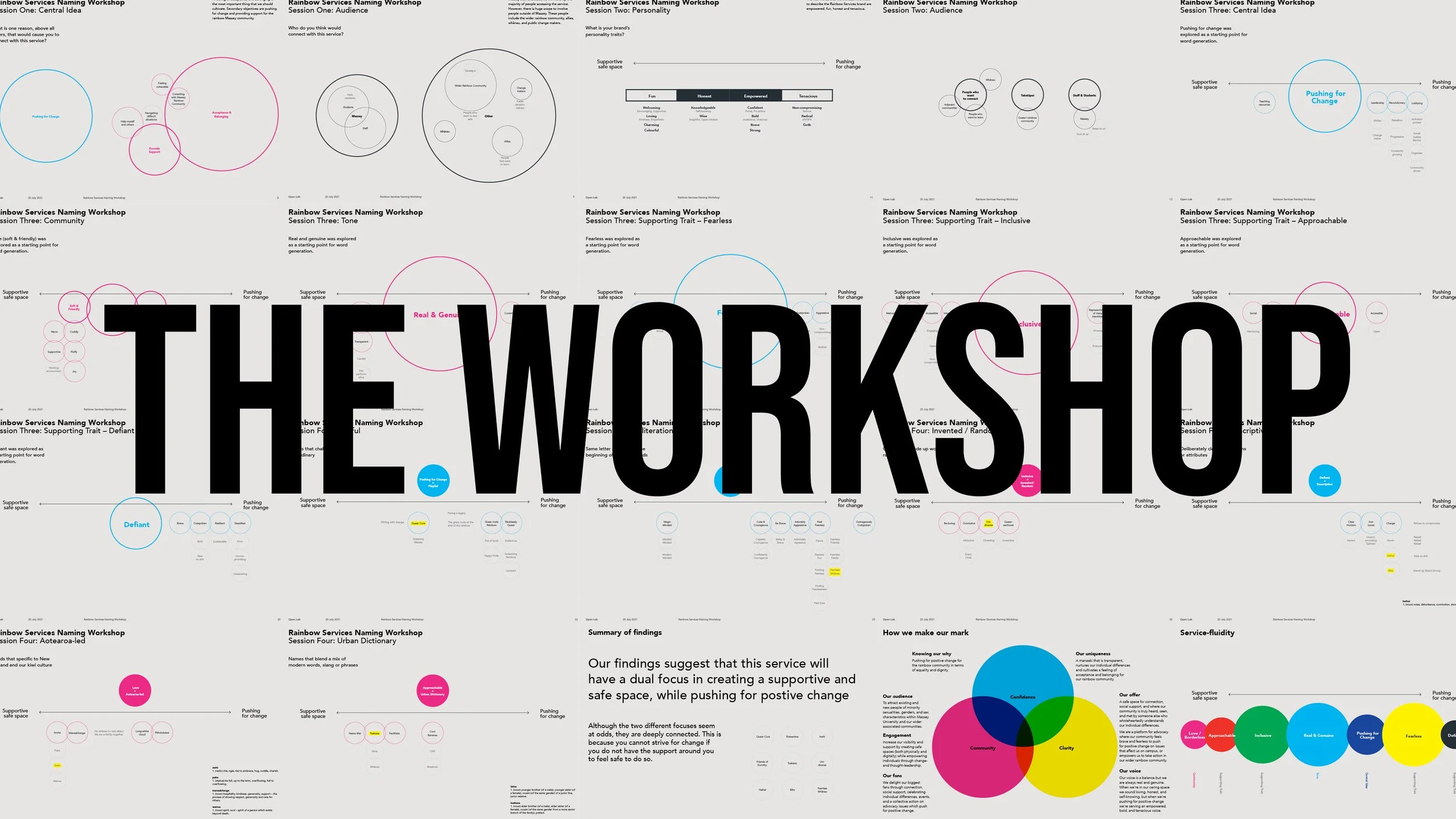
Facilitating workshops and ideation by running a collaborative workshop in Wellington that used design thinking exercises to generate ideas for brand names and positioning.
Launching a survey for inclusivity through an internal campaign, gathering insights from alumni, students, and staff across campuses and distance learning networks, receiving over 120 responses.
Refining design decisions based on user feedback, identifying key themes such as the need for a safe space, the drive for positive change, and the preference for a Te Reo Māori name.

Responsibilities
Leading creative teams by managing two separate teams—one for the discovery and brand development phase and another for the production and execution of the brand.
Facilitating workshops and research by guiding design thinking exercises to capture brand names and positioning ideas.
Developing and analysing surveys by designing an online survey in Qualtrics XM, crafting inclusive questions, and ensuring broad engagement.
Interpreting data and reporting insights by categorising survey responses, structuring the data for analysis, and presenting findings through clear visualisations.
Providing creative direction and mentorship by matching team members’ skills to workflow tasks, supporting their growth, and ensuring quality assurance throughout the creative process.
Engaging stakeholders by leading creative meetings, gathering feedback, identifying key takeaways, and streamlining the planning and execution of the project.


Tiriti-centered approach
Taking a Tiriti-centered approach to ensure that the platform authentically represented and uplifted the voices of takatāpui and rainbow communities. Central to this was the gifting of the platform’s ingoa, which held deep meaning and significance.
Engaging in a collaborative process through several months of wānanga, intention-setting sessions, and hui to ground the project in kaupapa Māori.
Receiving the gifted name from doctoral candidate Ngawiki-Aroha Rewita, with support from Associate Professor Hone Morris and Connor McLeod.
Honouring cultural significance with Kāhui representing a flock or grouping, while Irarau symbolising diverse life principles, genetic make-ups, and genders. The platform’s kaupapa aligns with the whakataukī, e koekoe te kōkō, e ketekete te kākā, e kūkū te kererū, acknowledging the natural diversity of rainbow and takatāpui communities.


A vibrant and meaningful visual identity
Creating a visual identity embodying a rich narrative and symbolic depth, drawing inspiration from the hero manu (bird) and showing a connection with the pride flag and the university’s brand colours.
Developing a flexible colour palette featuring interchangeable light and dark tones for versatility across applications.
Crafting a unique logotype with a hand-drawn approach that mirrors tail feathers, reinforcing themes of individuality and community.
Illustrating symbolic feathers in various shapes, sizes, and colours represents that we are all made with unique qualities.
Designing meaningful feather arrangements where tūī feathers symbolise wisdom and the sky, kererū feathers represent the forest, food, and vitality, and kākā feathers embody support, the Earth, and ancestral connections.
Selecting typography and graphic elements that contribute to a visual identity that is both celebratory and deeply rooted in kaupapa Māori.
Impact
Kāhui Irarau has had a tangible impact on the university community, improving student wellbeing, fostering connections, and enhancing academic retention and outcomes.
Increasing engagement by delivering the university’s first-ever rainbow orientation across all campuses, engaging over 600 students.
Strengthening community presence by interacting with over 1,500 visitors at Big Gay Out and Out in the City.
Achieving fundraising success by participating in Sweat with Pride, raising over $5,100 to support rainbow communities.
Expanding the platform’s reach by growing its social media presence and increasing awareness and engagement.
Celebrating a successful launch with ninety attendees marking the beginning of a transformative community initiative.
Gaining sector-wide recognition by presenting at the Cross-agency Rainbow Network Conference, sharing insights on indigenous knowledge and fostering connections within the tertiary sector.
Gaining recognition at the 2024 Rainbow Excellence Awards by taking out the Supreme Award and Impact Award.